This would be the beginning of documentation on my ‘Data Analysis’ journey. I look forward to making the best use of this avenue to showcase the possibilities of what I can do with ‘Data Analysis’. Cheers to a beautiful data-filled journey in this Data World.
This first project is to showcase the sales dashboard using data from the sales report of a Company. It’s from a YouTube video tutorial that I followed; join me on this journey, as I move from simple projects to complex ones!
Click here to watch the YouTube video that I practiced along to produce this dashboard — https://www.youtube.com/watch?v=KIDxe9CETos
NB: The data is relatively a simple one, so there was no need for data cleaning in this particular project.
Creating Pivot Table 1: Select the whole data on the master sheet, click on insert Pivot table to create Pivot table 1.
Creating More Pivot Tables: Select the whole data on the Master sheet, click on insert Pivot table to create more Pivot Tables:
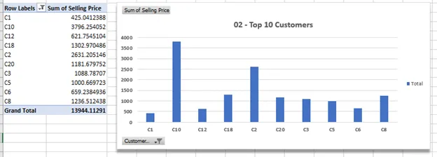
· Top ten customers,
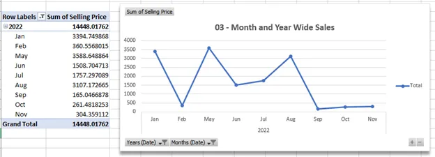
· Month and Year Sales,
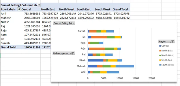
· Delivery Salesperson in each region.
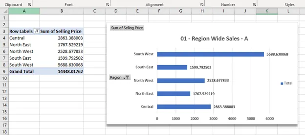
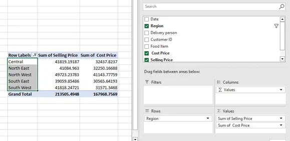
Extracting information. The next thing we want to do is to extract information that was not directly provided in the master data; e.g. the region that made the most profit. To get this information, we create a pivot table using the selling price, cost price, and region.
Make use of the insert calculate field feature under Pivot analyze to generate a new row: Sum of Profit (as seen below)
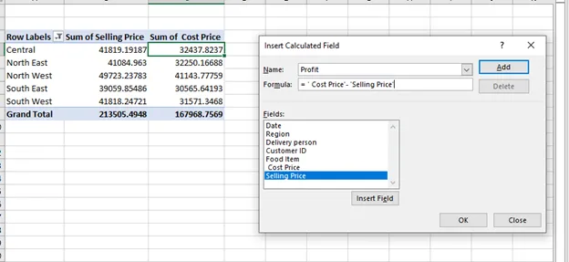
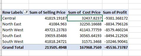
Sum of profit column, now inserted.
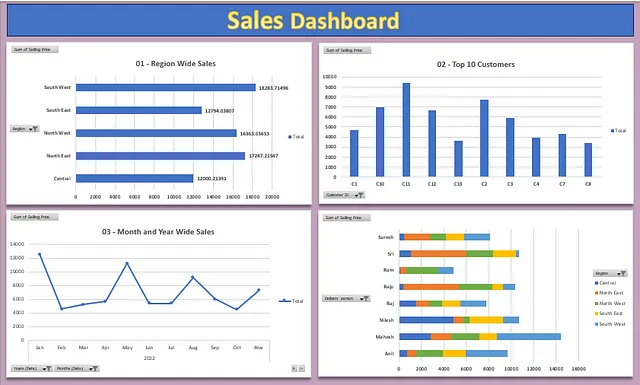
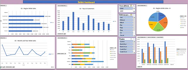
The above Figure 7: Dashboard 01 shows a combination of the first 4 charts we have generated from our data, simply by using the pivot tables.
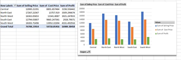
The use of Slicers when creating your dashboard is a very important and beautiful feature. When you have slicers in your dashboards, they provide us with the opportunity to see what happens in this scenario or that scenario, i.e., it can help to bring our peculiar scenarios or case studies.
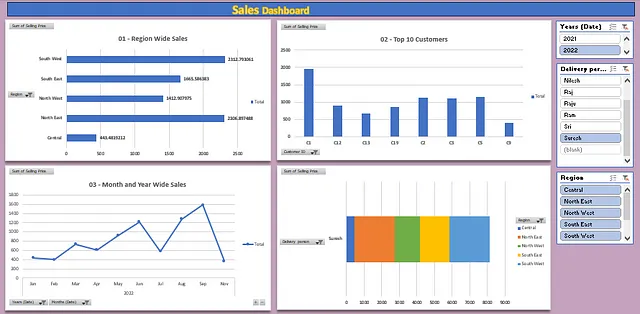
The next set of images below gives us the region-wide sales, Top 10 Customers, month- and year-wide sales. Figures 9 and 10 show the details for the first two delivery personnel: Ani and Mahesh in 2021, while Figures 11 and 12 show the details for the last two delivery personnel: Sri and Suresh in 2022.
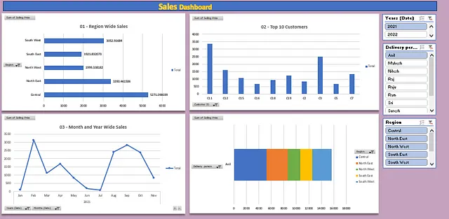
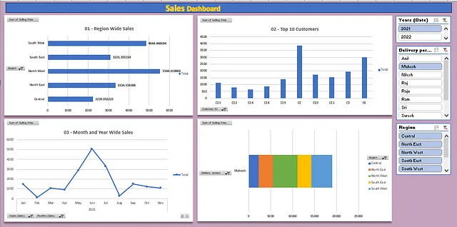
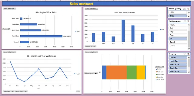
Figure 11. Dashboard C — Sri 2022.
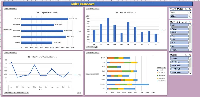
In rounding up this report, I’ll also showcase the full master dashboard for this report. It features six (6) charts and three (3) slices. The next two images show the master dashboard for 2021 and 2022, respectively. This is to help us appreciate the overall analysis done with this data and to also see an overview of the company’s performance within the two years under review.
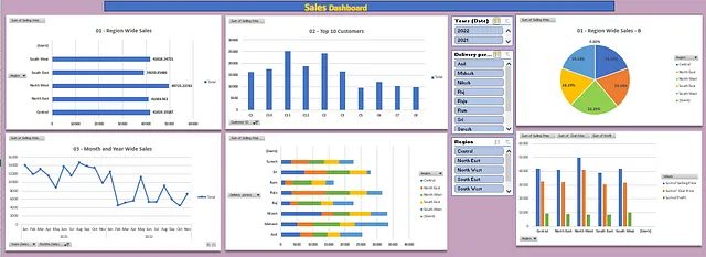

Figure 13B. Full Master Dashboard 2021, showing with the aid of Slicers